Learn Gutenberg 5: Design Elements
In the previous article we teach the format blocks. In this chapter I am going to show you Learn Gutenberg 5: Design Elements.
In design blocks we find blocks that form more complex compositions, such as the one with text and image or the block of columns.
Contents
Blocks that are part of the Drawable Blocks
Within design blocks We currently find the following blocks:
- Button
- Columns
- Media and texts
- More
- Page break
- Separator
- Spacer
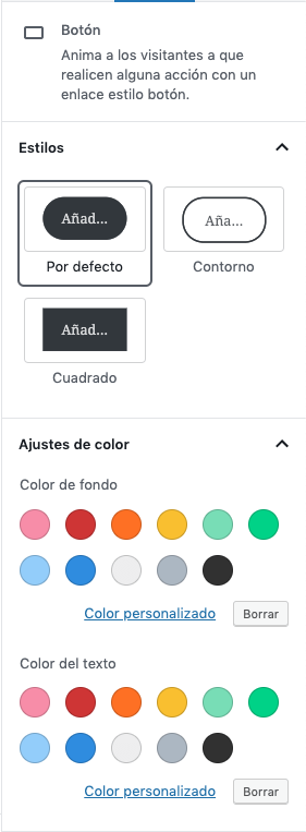
Button block
With the button block We will be able to add, as its name indicates, buttons to our entries. In these buttons we will be able to put any URL, but we will not be able to add to the button the option that opens a new page.
We can add the text we want to the button and change the color of both the button itself and the text inside.
In addition, we can change the style of the button, we can decide whether to fill with rounded or square edges, or add a border to the rounded button (this border will be the same color as the font).
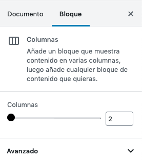
column block
El column block allows us to introduce columns within Gutenberg. The only configuration that this block gives us is to be able to choose the number of columns that it will have. These columns will have the same width.
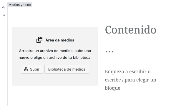
Media and text block
El media and text block, as its name indicates, allows us to add a composition of an image next to a text. The block will allow us to choose if we want the image on the right or on the left.
In the content column we will not be able to put any type of block, it will limit us to certain blocks such as paragraphs, titles, lists and buttons.
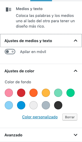
In addition, we will be able to choose how it looks when we go to the mobile version, whether to keep the same structure or to have one stack under the other element. Also, it will let us choose the background color.
“more” block
The "more" block is not a visual block at first. What this block does is that the page where all the articles are displayed (archive) will cut the excerpt where we have placed this block.
It's a very simple block that hardly needs more configuration than adding the block and it's ready to go.
page break block
The page break block will allow us to separate our entries on different pages. It is something very useful that will allow us to better organize our contents. In addition, it does not have any configuration, it is to place the block and that's it.
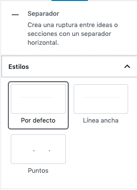
separator block
The separator block will add a line to separate our contents, it is a very simple block that comes with three different styles by default, the default is a short centered line, the wide line and dotted.
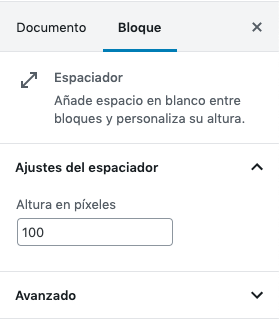
Spacer
The spacer block allows us to add, as its name indicates, space between blocks. It is a very simple block to use, since the only configuration it has is to be able to choose the height of the block.
If you liked Learn Gutenberg 5: Design Elements and you want to continue learning about Gutenberg, in this link you will find more articles related to the new editor.
¡Subscribe to our newsletter and receive our offers, news and discounts directly to your email!


